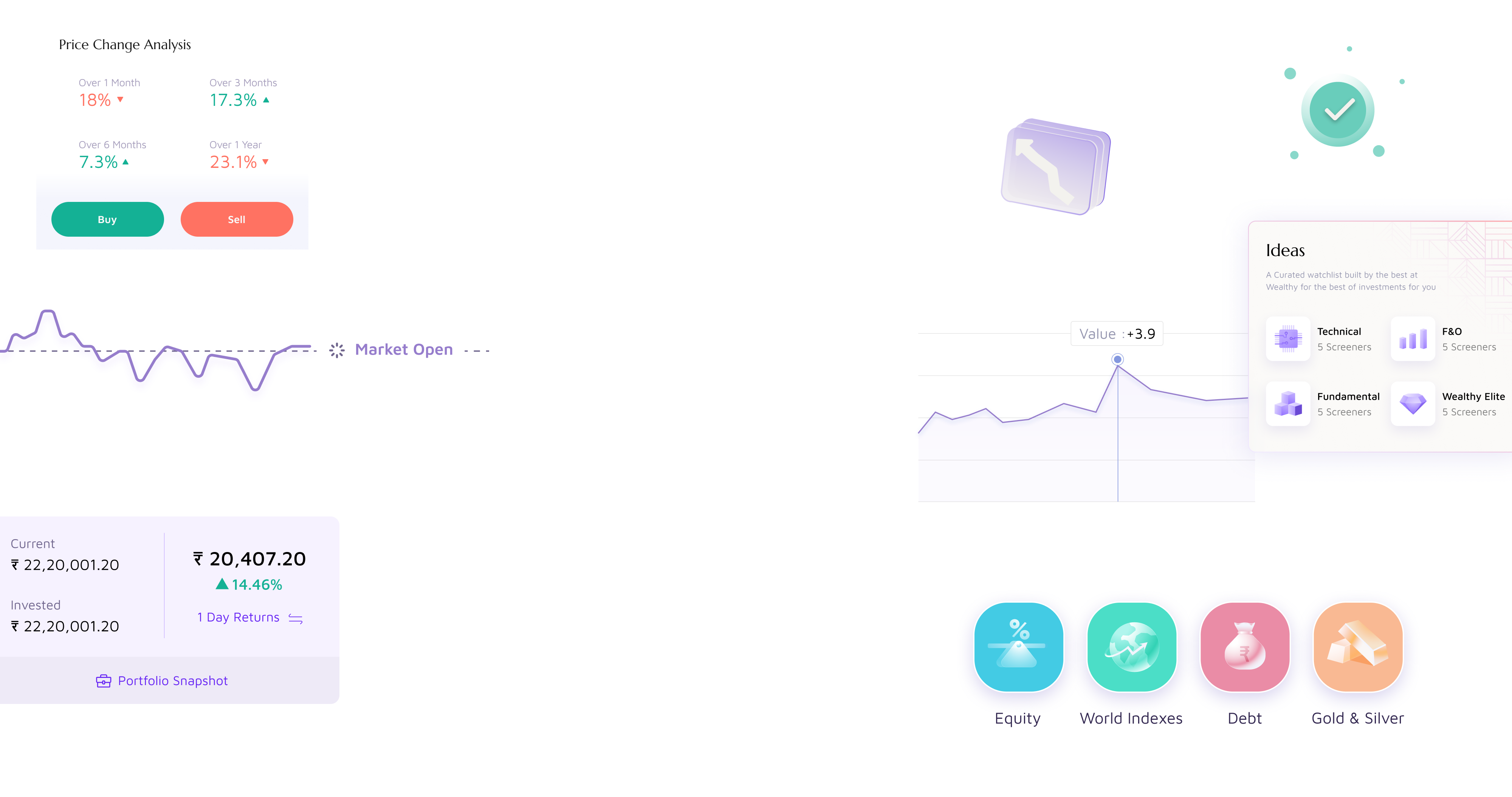
Designing Wealthy’s trading ecosystem from the ground up.
Wealthy was an investing platform. Introducing broking meant building an entirely new product, account opening, market discovery, stock analysis, trading, portfolio management, and fund movement, in five months.
The trading side needed a few seconds to load market data. This meant the app had to be designed around two “faces”, Invest and Stocks, separated by technical limitation, not user intent.
Regulatory requirements meant users couldn’t see any broking content until they completed the full KYC process. Discovery had to be designed around a gated state.
Mapped how every module connected into a single product before designing any screen
Understand where users come from, what they need at each moment, and where they go next
The product organized into six connected journeys
“Mapping the product first meant every scoping conversation had a shared reference, what’s V1, what connects to what, and what can wait.”
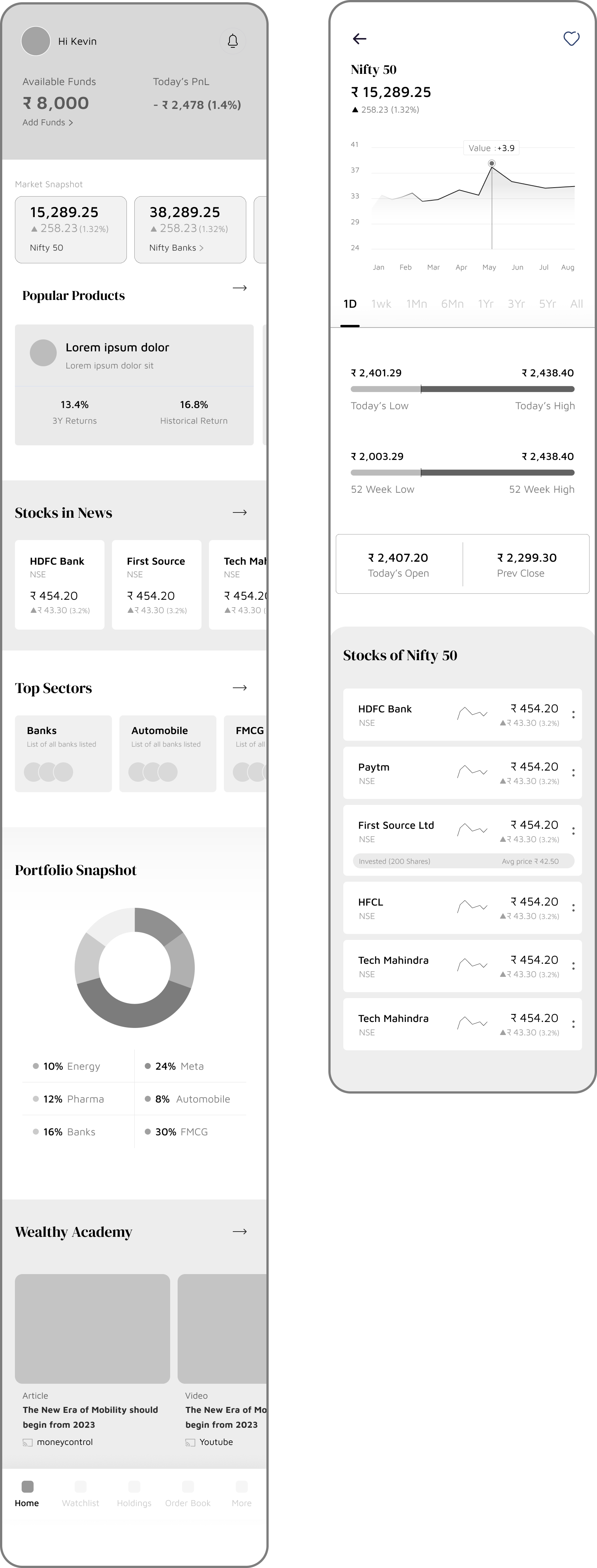
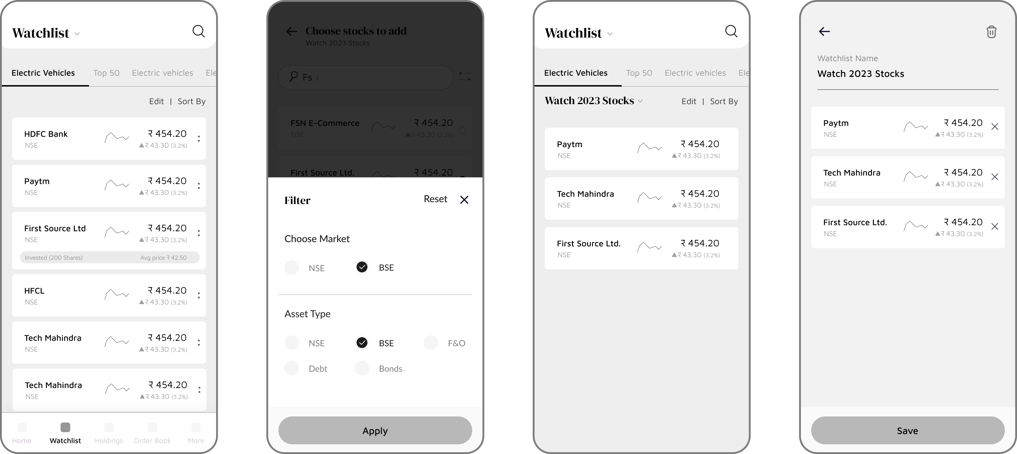
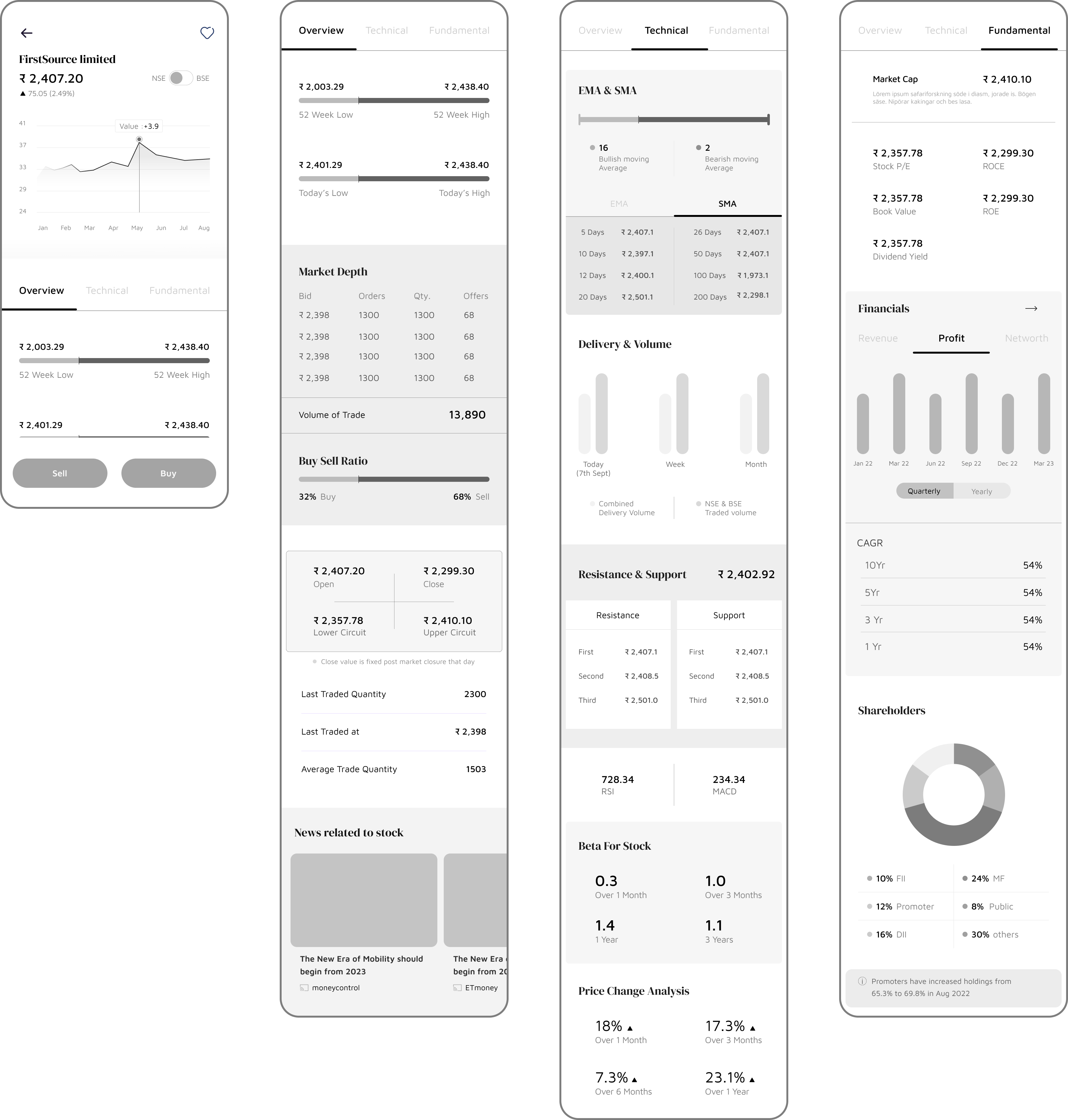
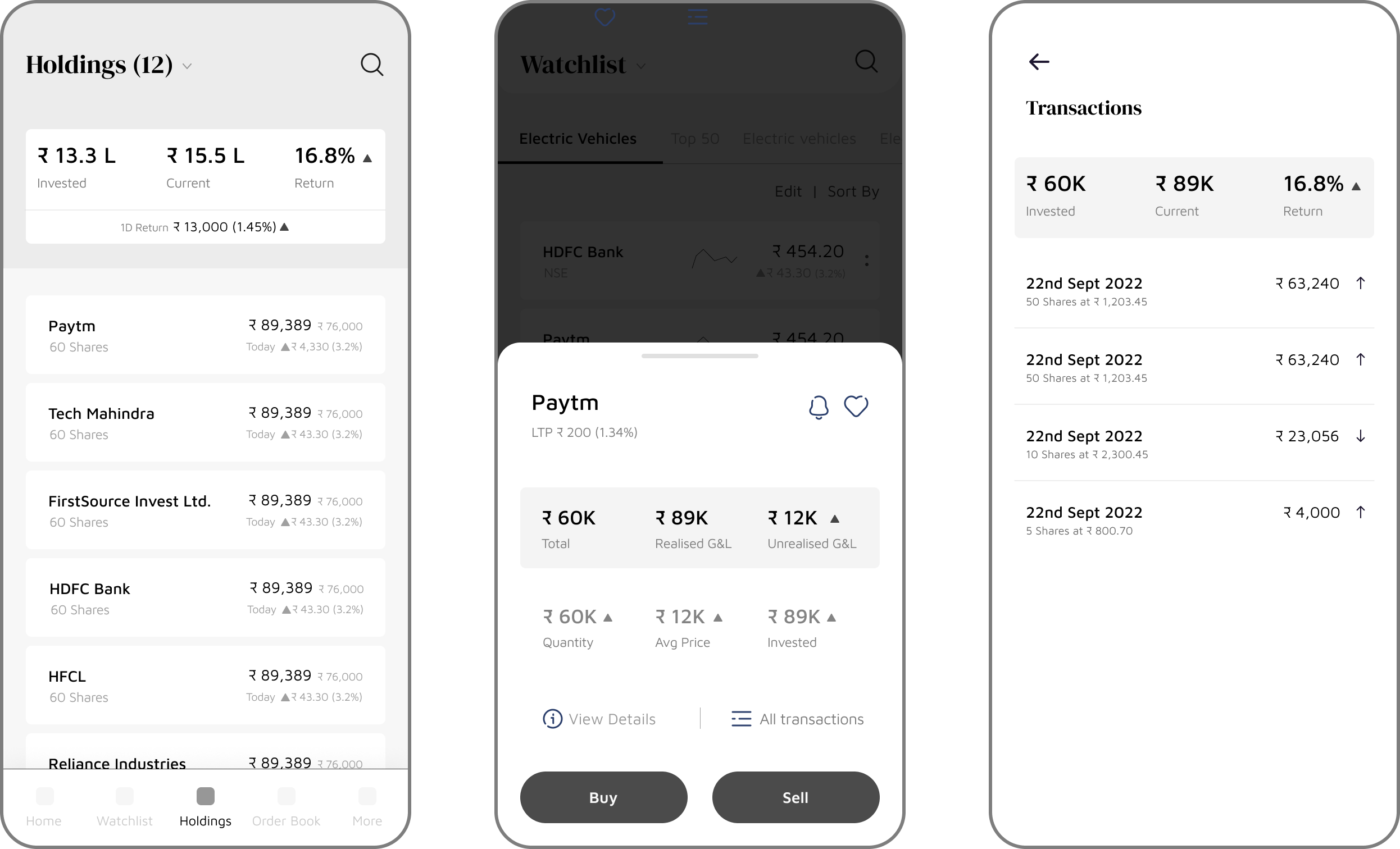
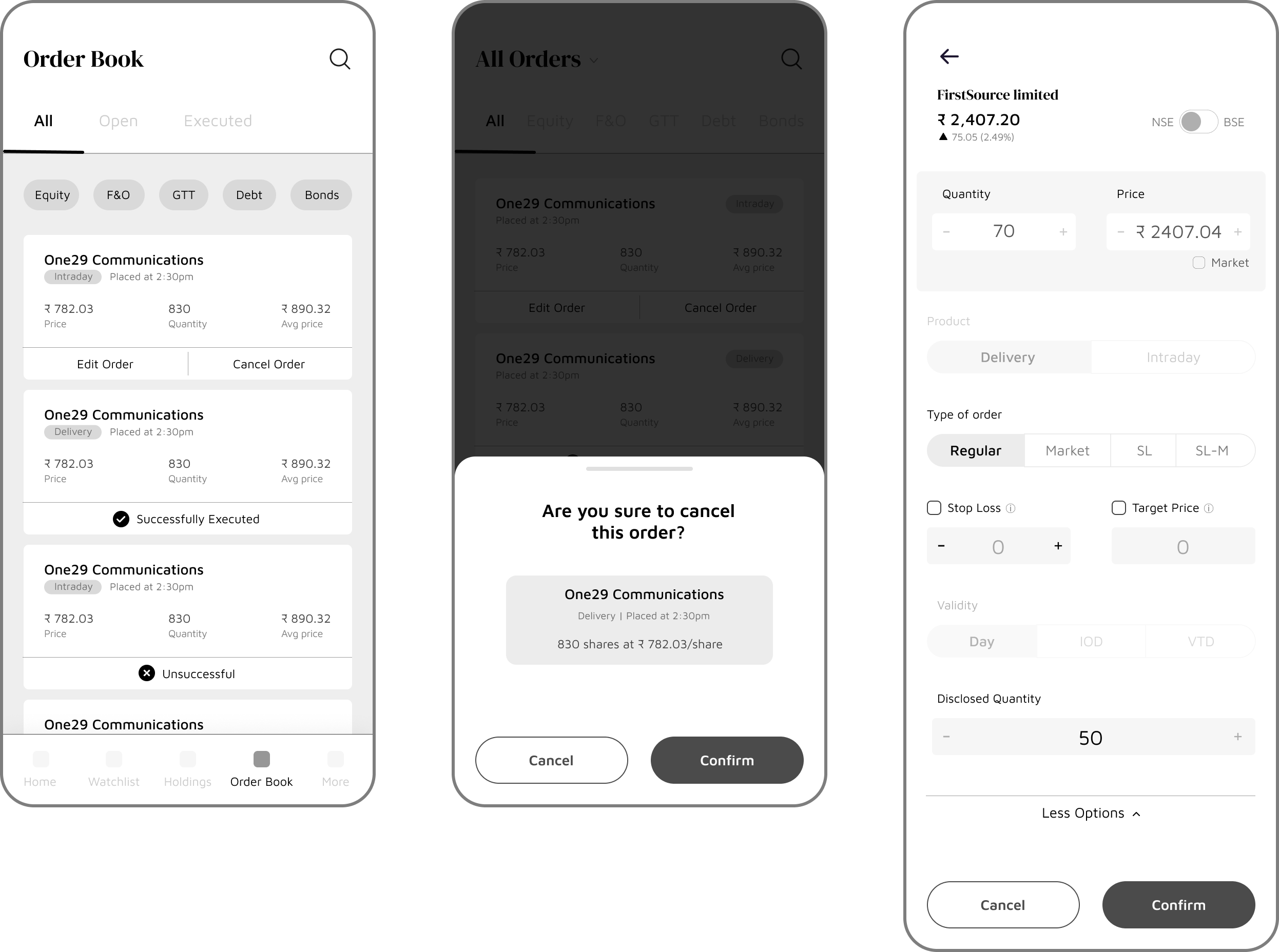
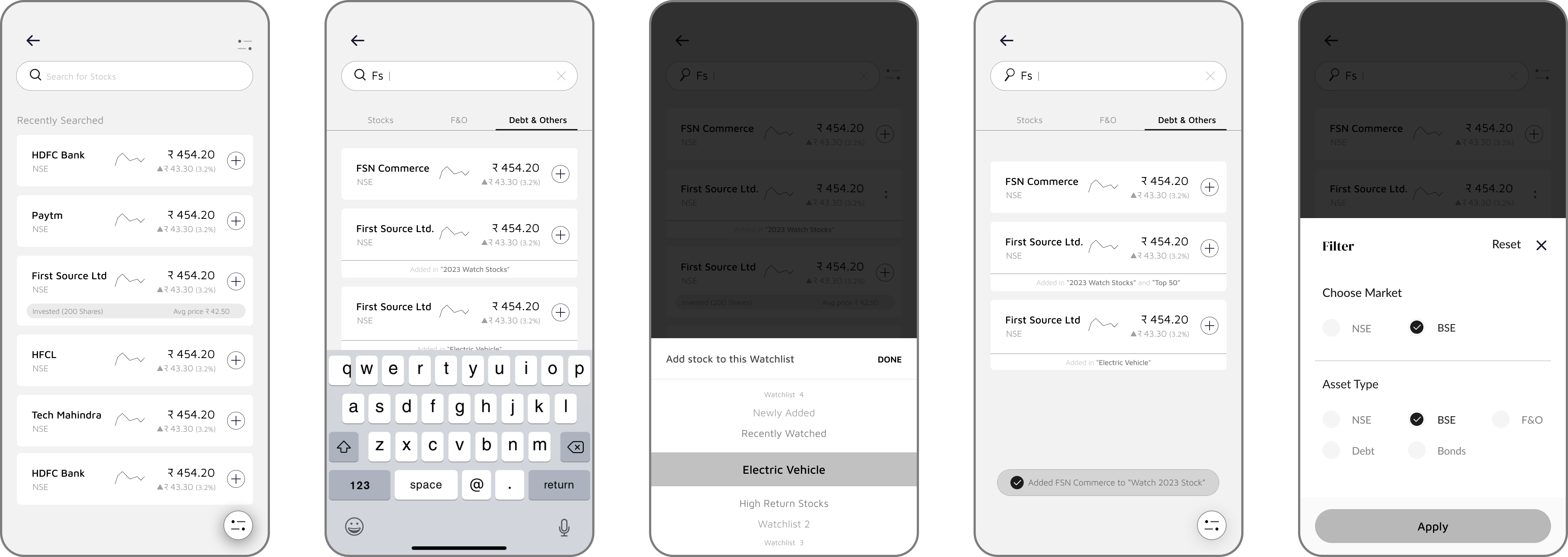
The core journey from finding a stock to placing a trade.
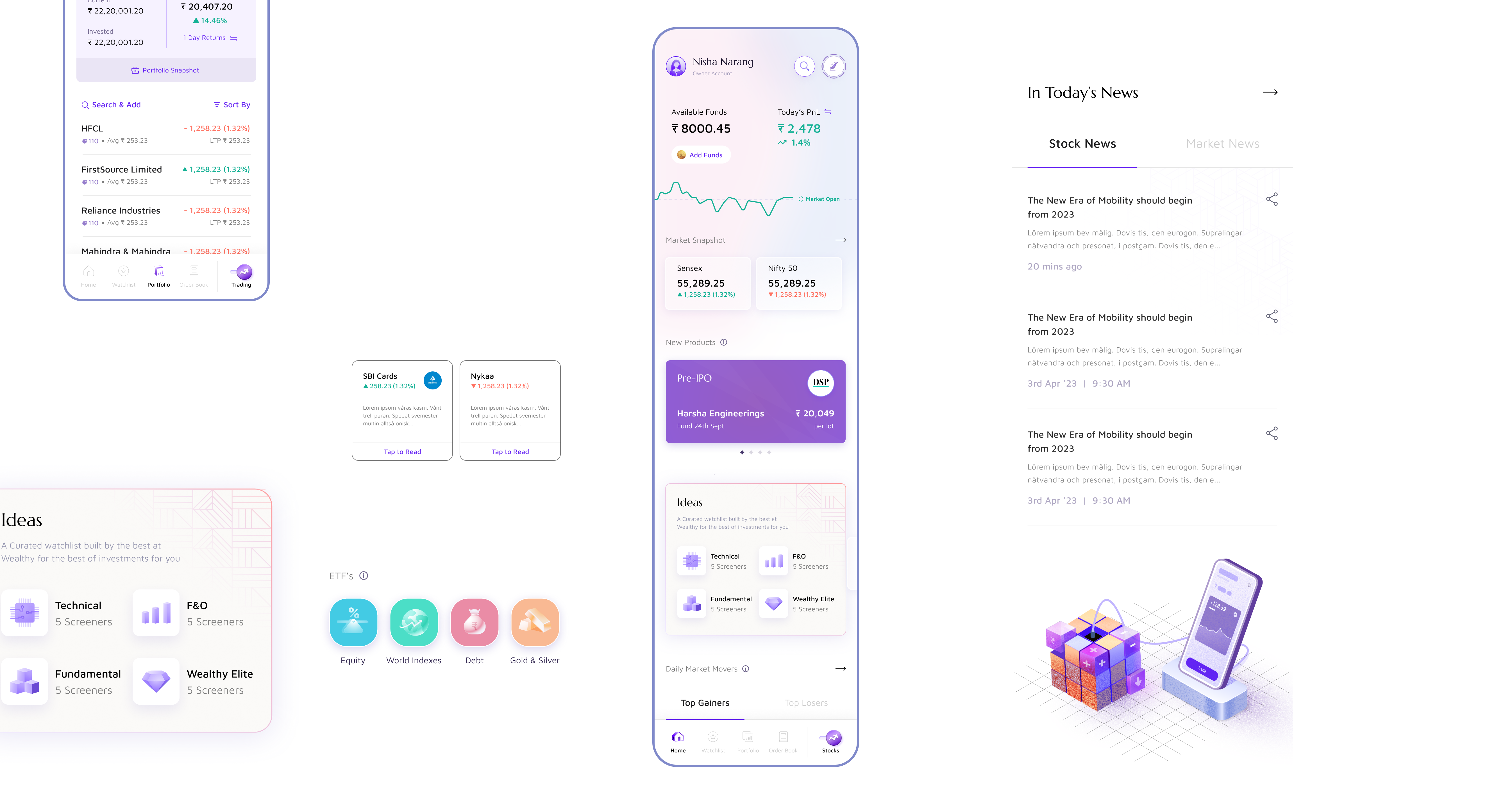
V1 was conservative and functional, but it didn’t feel like Wealthy. A competitor scan confirmed we were blending in.
This led to a visual upgrade, bringing the trading experience up to the design standard users expected from Wealthy.
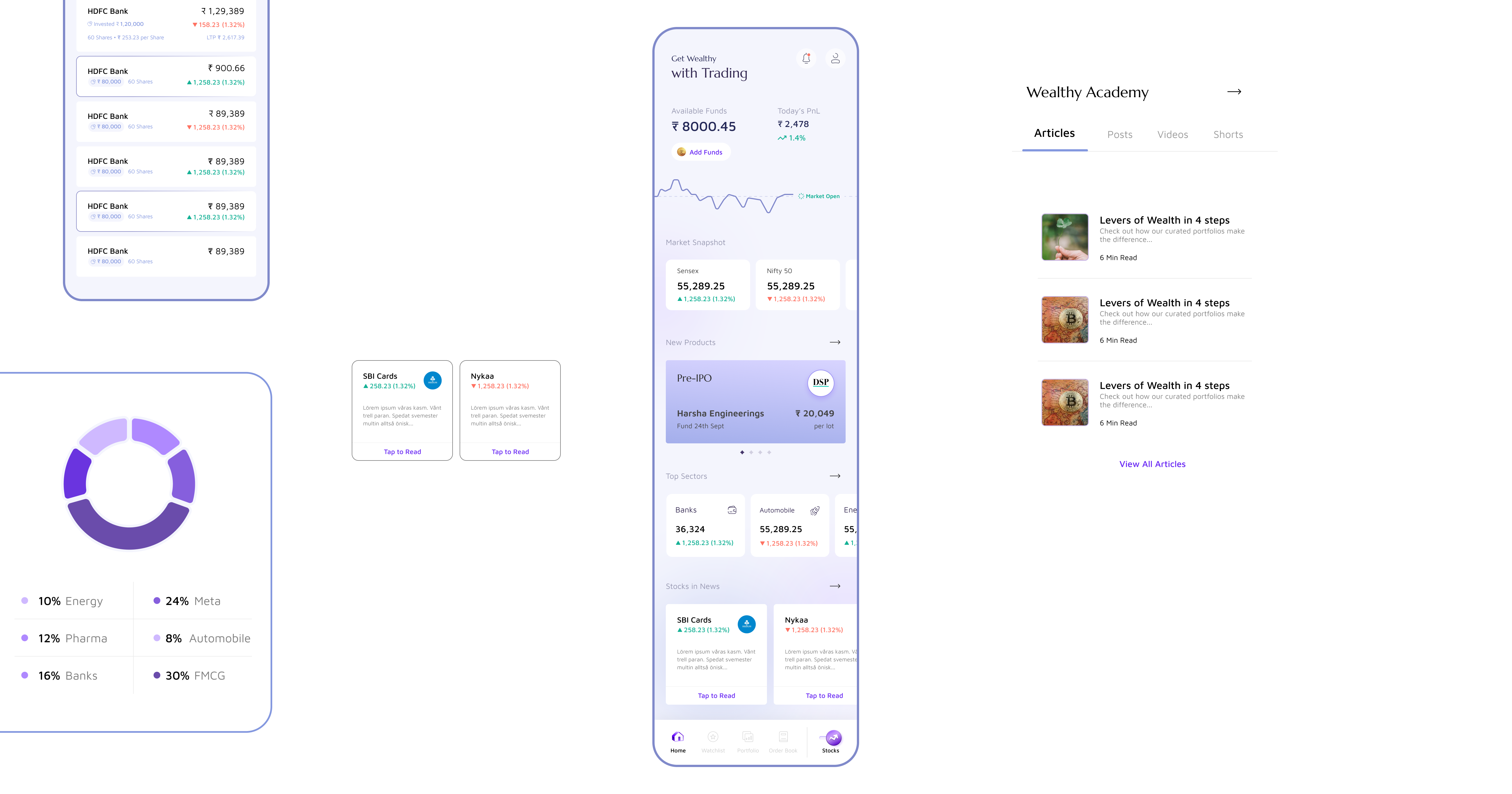
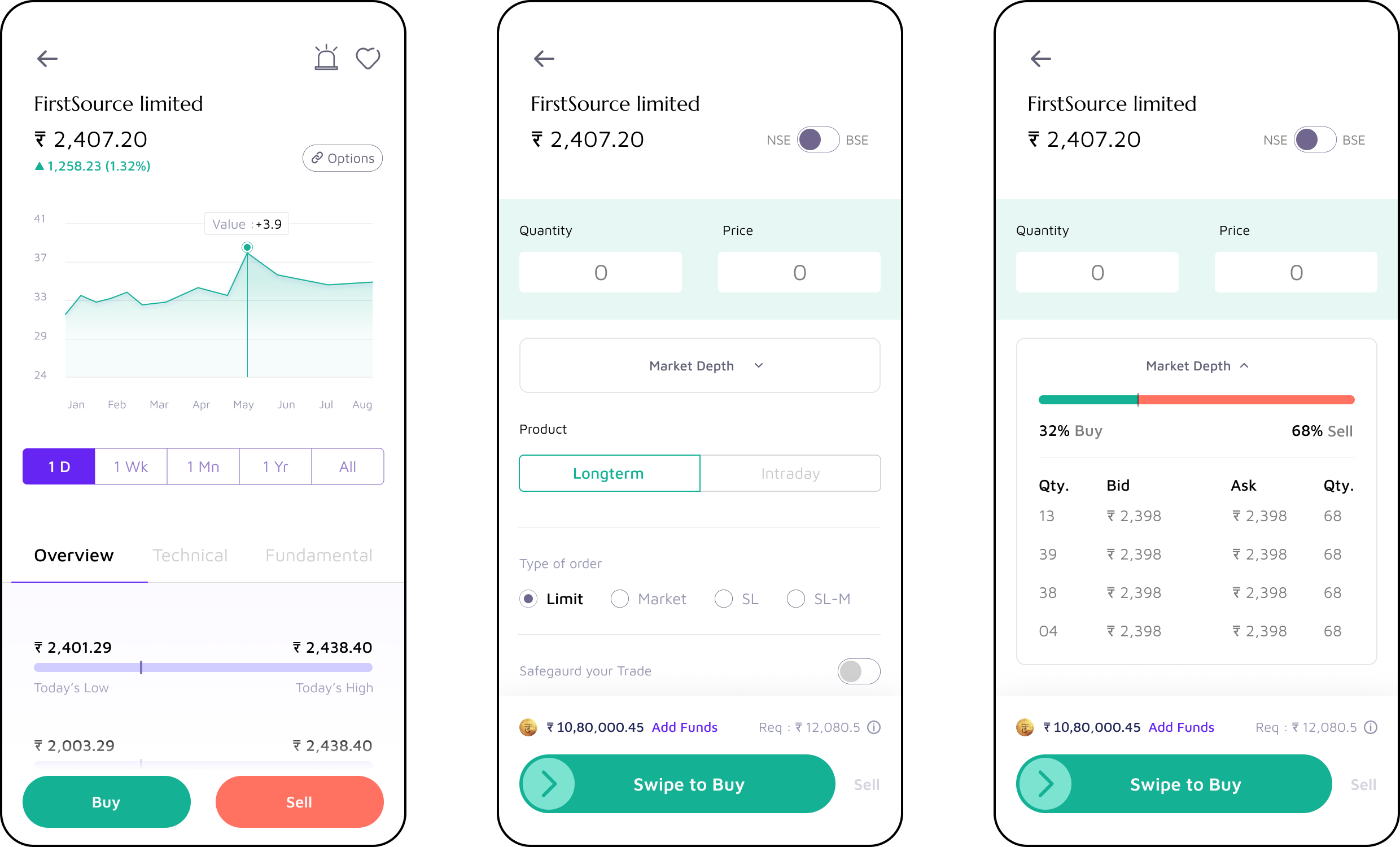
We used IIFL as a reference to understand what data points mattered and what was feasible to build. But instead of copying how other trading apps showed stock data, we made the SnapQuote feel like the mutual fund detail pages users already knew on Wealthy. Same app, same patterns.
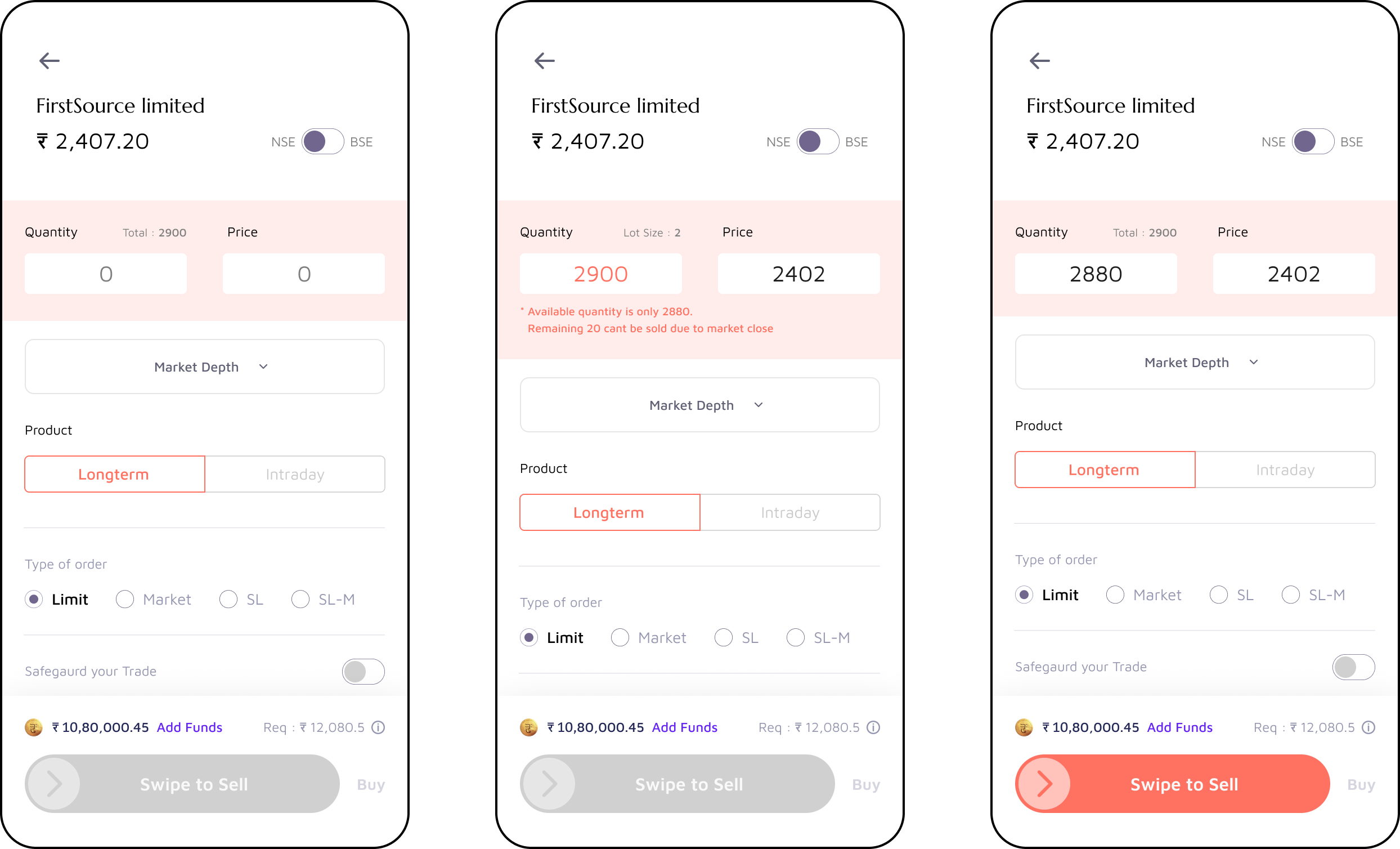
The most debated screen. We kept essentials visible (buy/sell, quantity, price) and tucked advanced options into expandable sections. One form for both quick market orders and detailed stop-loss setups.
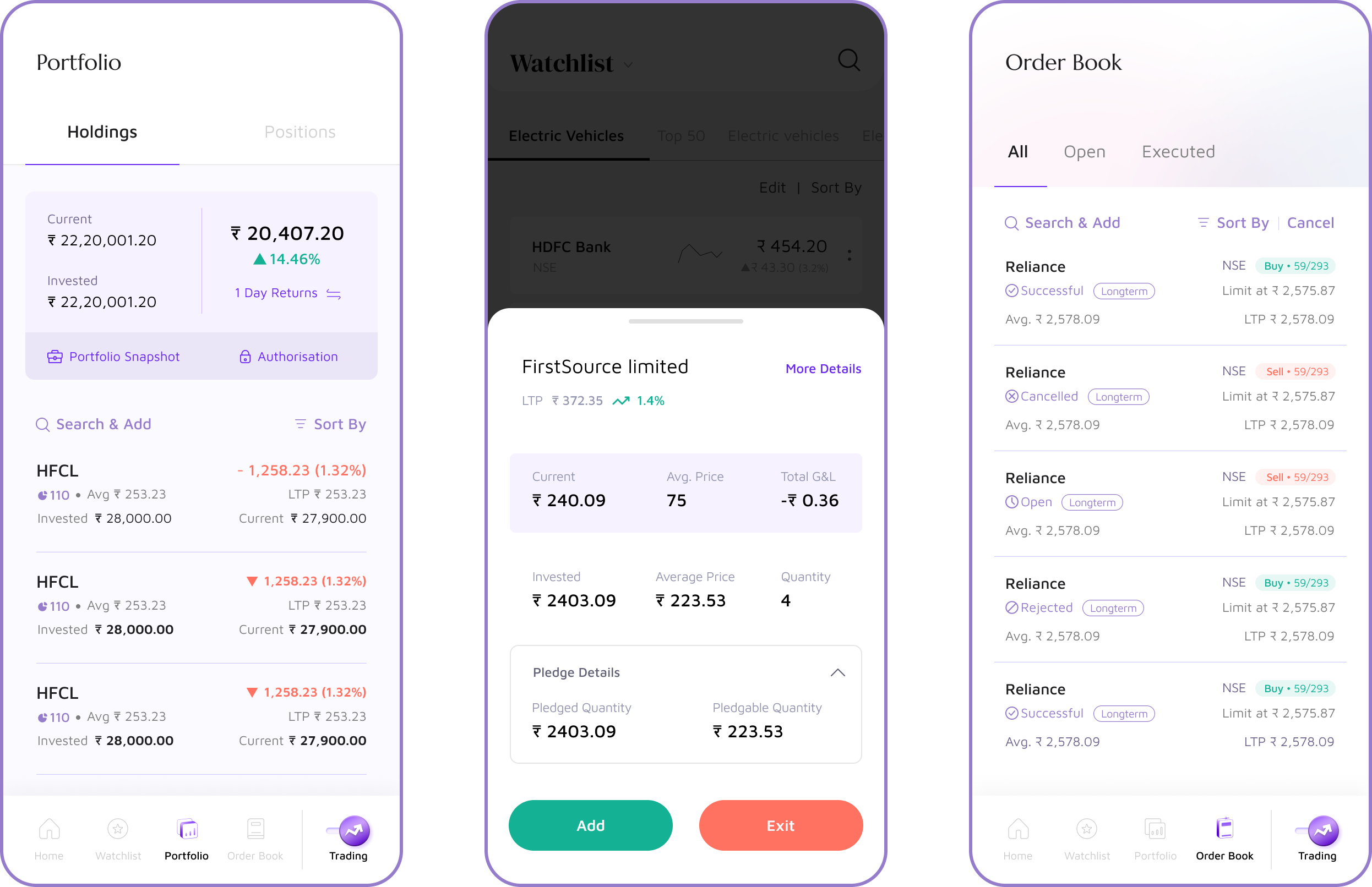
Once someone owns a stock, they don’t want to go back to the detail page just to buy more or sell. Pop-ups with inline actions right from the list, with a tap-through to the full view when needed.
Sell proceeds stay in-app as available funds, no waiting for bank transfers. Balance and today’s PnL are always visible at the top of Explore.
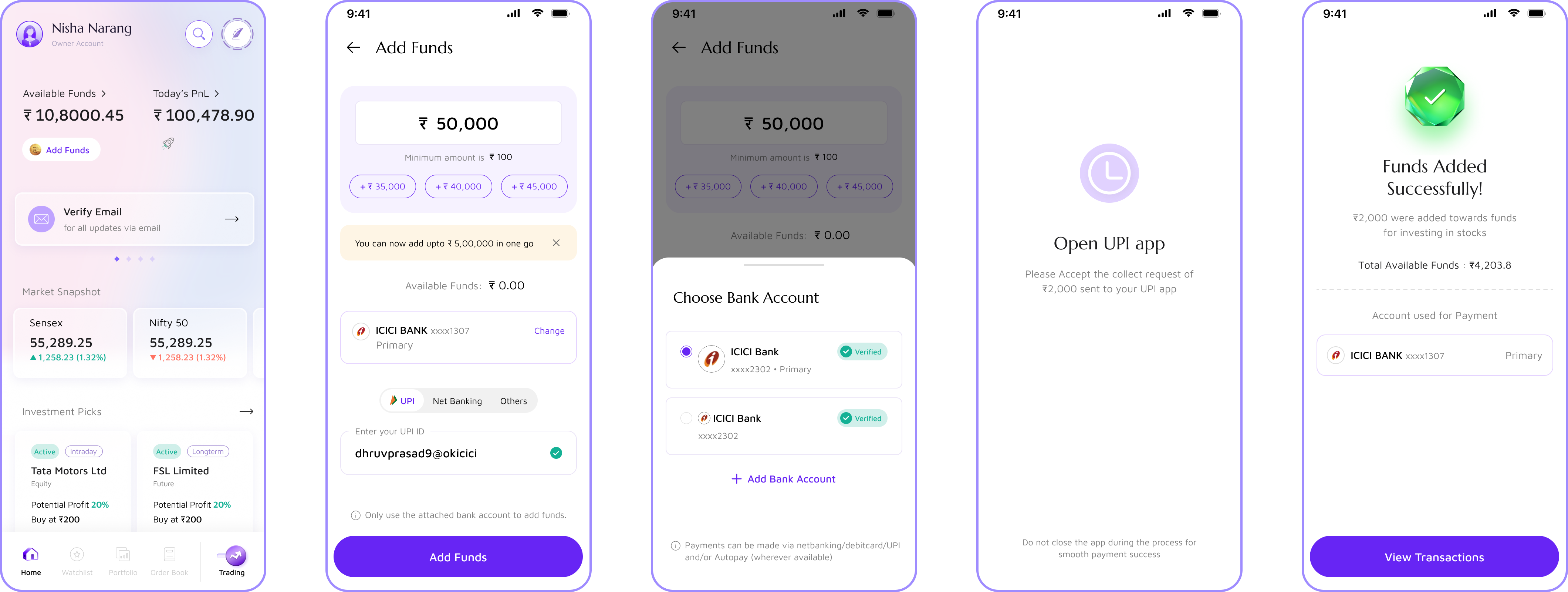
There was no existing design system, so we built everything from scratch. But we treated the trading side as the foundation for eventually unifying the whole app. Components were built to work on both sides, and holdings were kept similar to mutual funds on purpose.
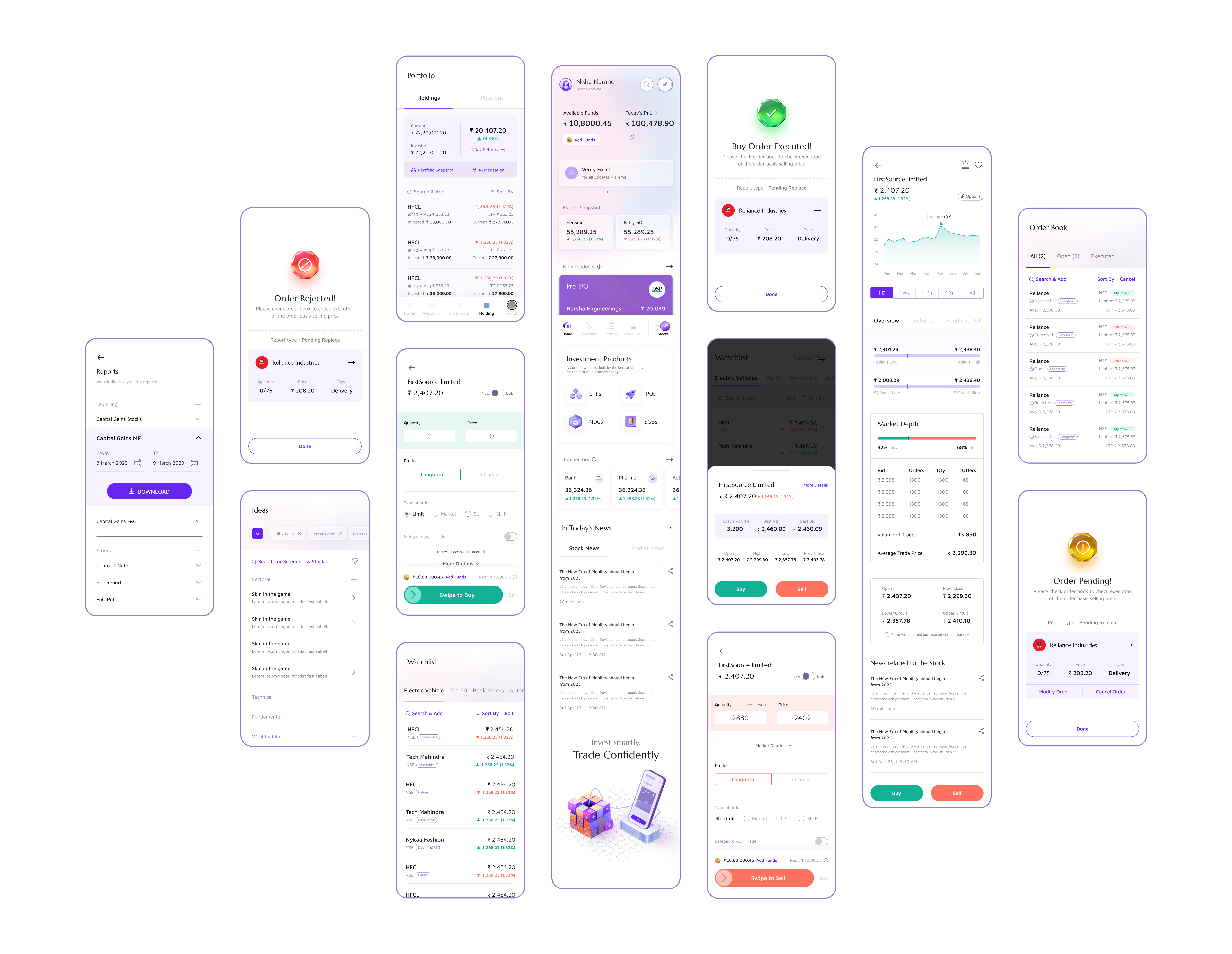
Stocks sat in the nav bar. Tap to switch between Invest and Stocks, with a pop-up to set your preferred default. One app, two modes.
Launched February 2024. No features were cut because scoping happened early in design. The team took slight timeline delays over dropping anything from the agreed V1.
Building a full trading ecosystem in five months was only possible because we mapped the complete journey before touching any individual screen. That map became the decision-making tool for every scoping conversation, what’s V1, what connects to what, and what can wait.
Prototypes shared on Slack and with family and friends surfaced things internal reviews missed, like the order form showing too many fields upfront, or the app not feeling like Wealthy. The most useful feedback came from people using the prototype with their own intent, not evaluating it as a design artifact.
Instead of building broking to fit into Wealthy’s existing design, we built it as the new construct, scalable components designed to eventually pull the Invest side forward into the same system. The new face of the app became the blueprint for the old one, not the other way around.
Wealthy Broking shipped as a complete trading product, designed from the ground up to be powerful enough for serious traders and coherent enough to feel like Wealthy.