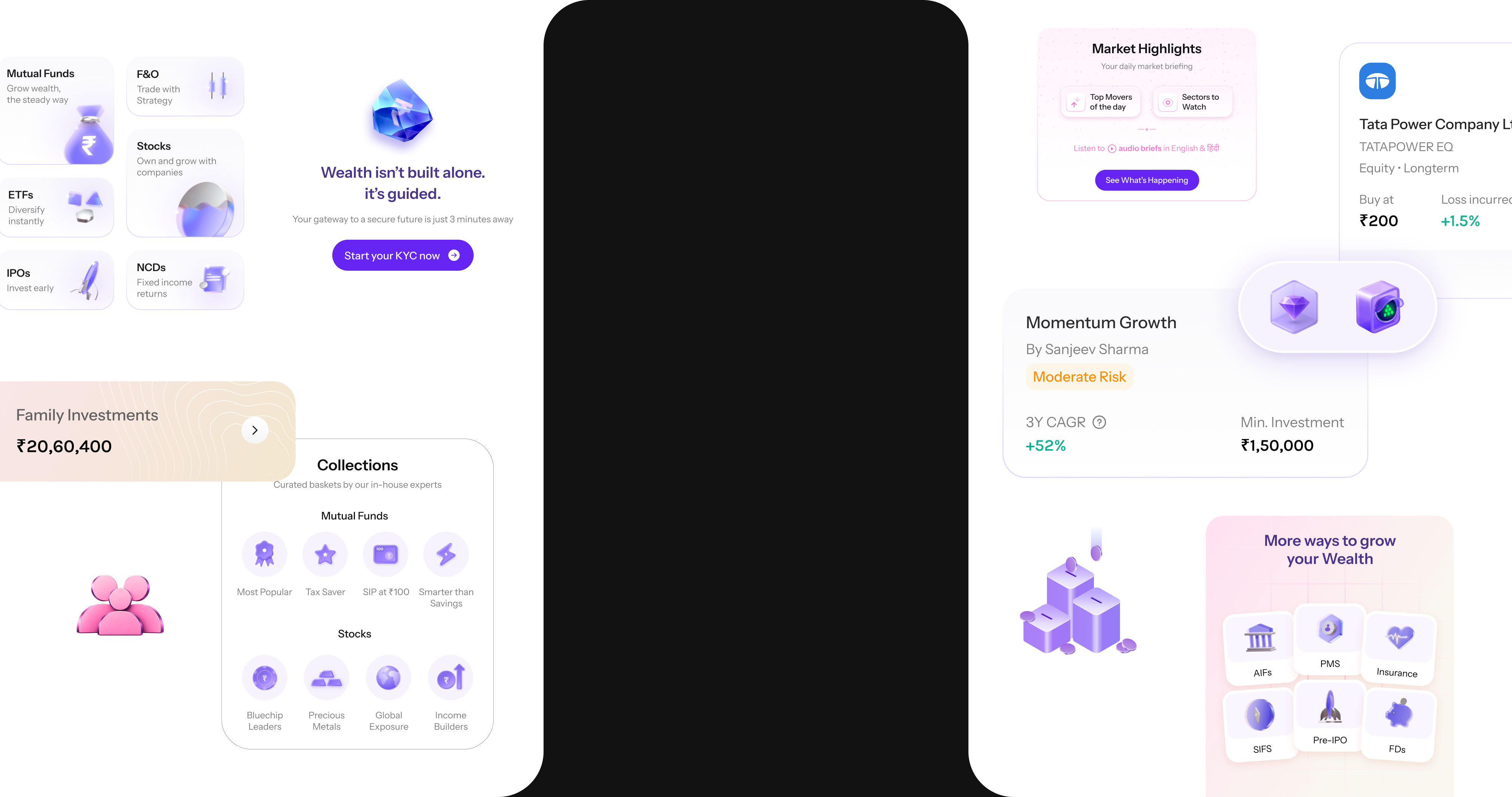
The new home, portfolio overview and unified discovery in a single surface
From invisible feature to unified investment experience.
Designed the discovery and activation strategy for broking within Wealthy, transforming a two-sided product into a unified investment ecosystem.
When Wealthy launched broking, it evolved from a long-term investment platform into a full-fledged investment platform. Users could now access Mutual Funds, Stocks, ETFs, F&O, IPOs, Bonds, SGBs, Wealthcases, and Wealth Signals: all within a single app.
The question was never whether broking could work. It was whether users would ever find it.
To hide this loading limitation, the product was designed around two distinct “faces”, separating investment types by technical capability rather than user intent.
The assumption was that clearly separating these experiences would make broking easier to understand and discover.
Post-launch research revealed that users were largely not noticing the Stocks/Broking switch. The feature existed. The problem was visibility.
We wanted to test with minimum development effort.
Mutual Funds and Stocks moved into visible tags at the top of the home screen, no more hidden tabs.
Lightweight market snapshot, sector performance, and previous-day info shown before KYC, zero commitment.
Give users enough context to understand that broking existed, create curiosity, not pressure.
“Why were we still relying on users to intentionally discover Stocks?”
The numbers told us what happened. Research told us why.
A significant portion of users were coming through Wealthy's wealth partners, entering with a specific task, not an open mind.
Users weren't entering with an exploratory mindset. They came to do something specific, check a portfolio, make an investment, review returns.
The user's mental model was “I'm here to manage/invest my money”, not “Let me explore all the products Wealthy offers.”
The separation between products was a technical convenience, not a user need. We needed one unified discovery surface where products appear wherever intent naturally shows up.
The home tab becomes the default landing, where discovery, search, and portfolio insights start working together to surface what matters most to each client.
Investment Overview, portfolio at a glance, key movements, performance trends, important changes. The first thing users need when they open the app.
Unified discovery surface, Mutual Funds, Stocks, ETFs, Wealthcases, Wealth Signals, Broking, and other instruments. No category gate. Just opportunity.
All asset classes, MFs, Stocks, ETFs, Bonds, IPOs, live in a single discoverable surface. No tabs, no modes, no hidden switches.
Broking becomes something users encounter naturally within their investment journey, not a destination they have to seek out.
Understanding your money and discovering new opportunities happen in the same place. Portfolio insights inform what surfaces next, context leads to action.
A cohesive home builds the foundation for personalization, discovery, search, and portfolio insights feeding into each other to surface the right instrument at the right time, for each client.
The experience moved from “Where do I go?” to “What should I look at next?”